DIY Aesthetics
Carrying the torch from a storied visual history of torn up, photocopied, and do-it-yourself aesthetics, the challenge was to find new ways to make the magazine feel modern, while still embodying the ethos of their motto “skate and destroy."
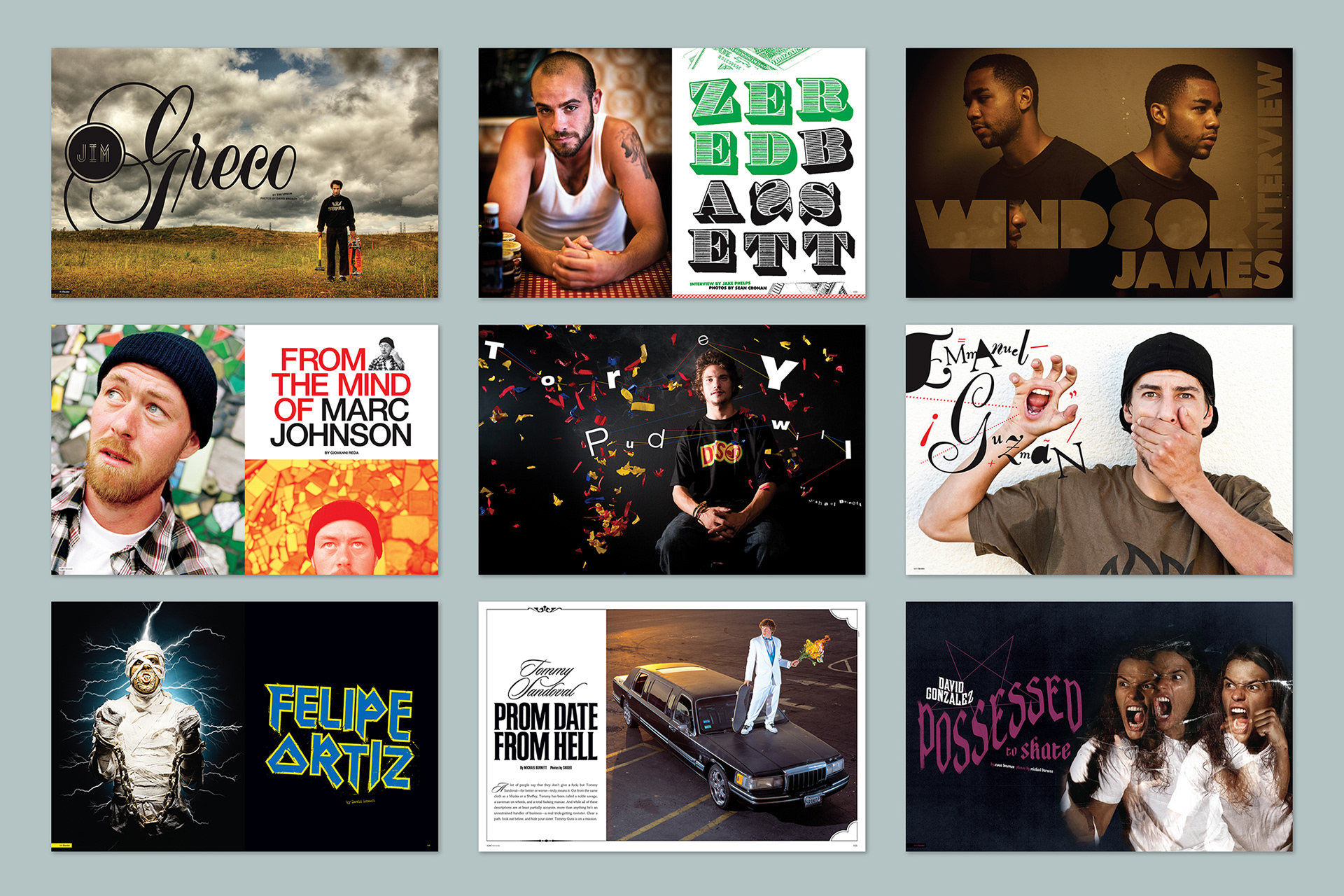
No Two Layouts The Same
Since the art department wasn’t beholden to a specific set of typefaces, Dan took the liberty to never make any two features look the same.
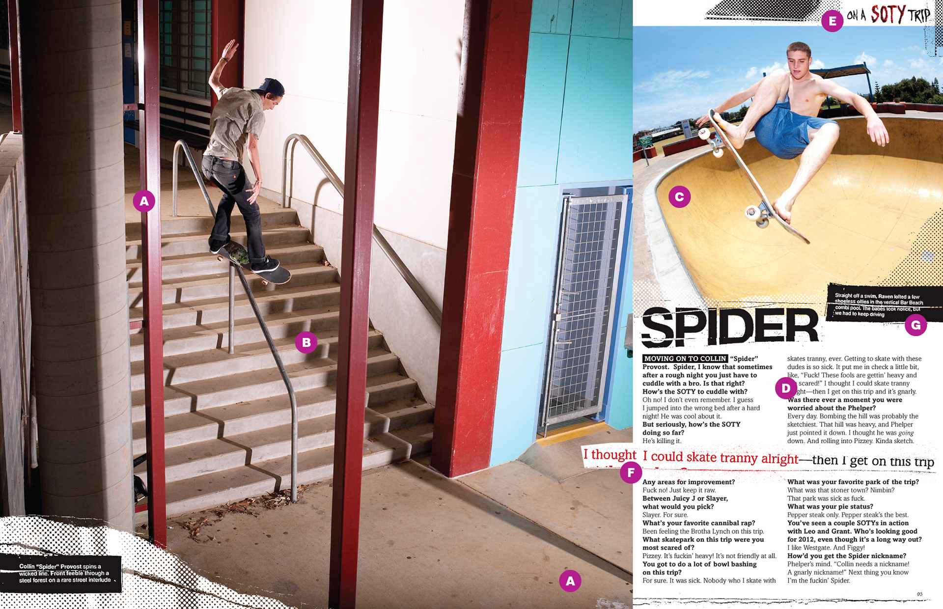
Anatomy of a Skateboarding Layout
A) Always show the takeoff and the landing. B) The direction of the main action goes into the spread not off the page. C) Lifestyle accent photo or less impressive skate trick goes here. D) Depending on the photo width, text gets one or two columns. E) “Page flags” reflect the design of the opening spread. F) Pull quotes are an added design element of stoke. G) If not in the lower corner of the page, captions go in a logical, legible place.
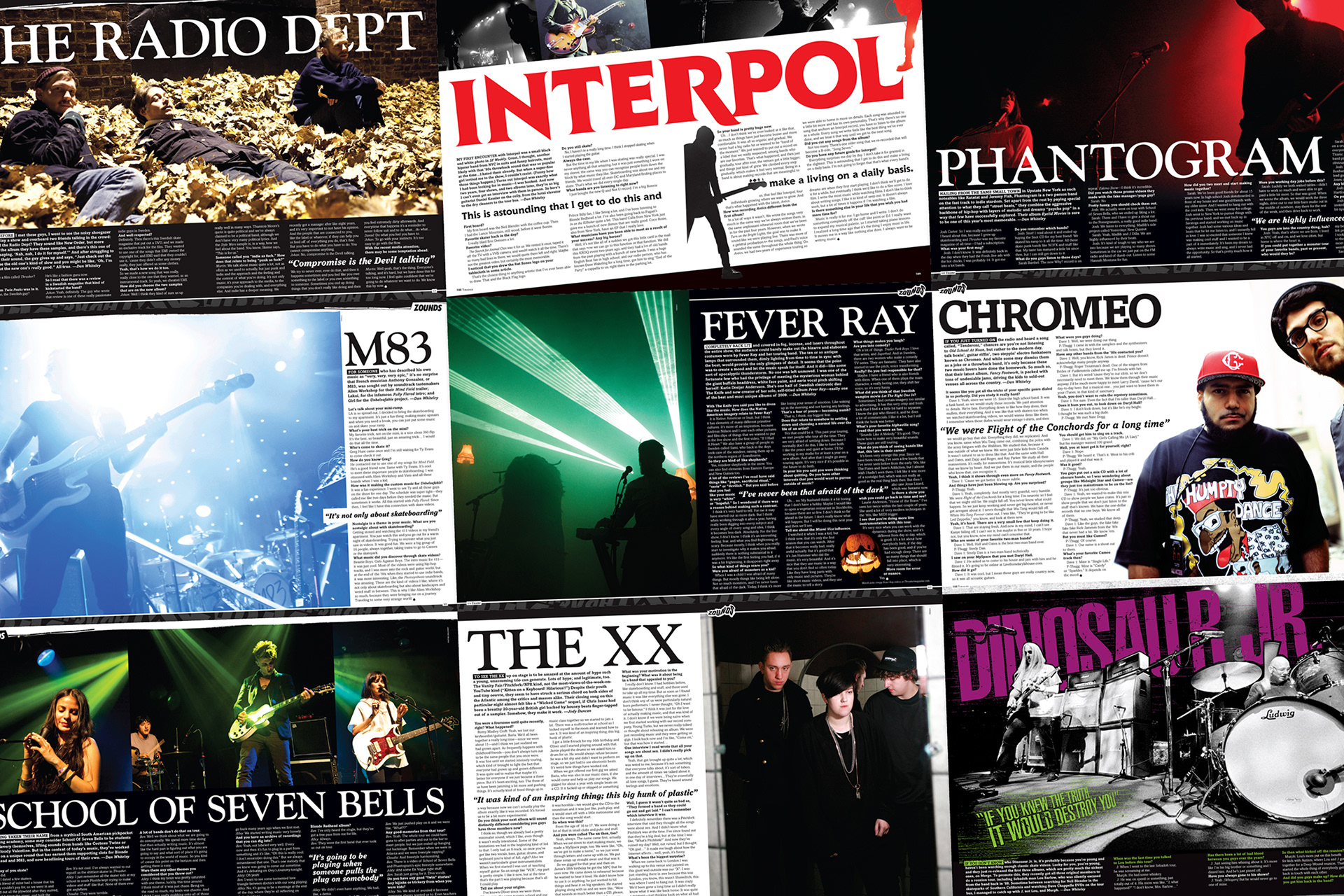
Zounds good
Dan interviewed all of his favorite bands and designed the layouts for Zounds, the music section in the back of the book. In the early years, a custom layout was made for each artist until a single font choice was settled on for them to run consistently throughout the department.
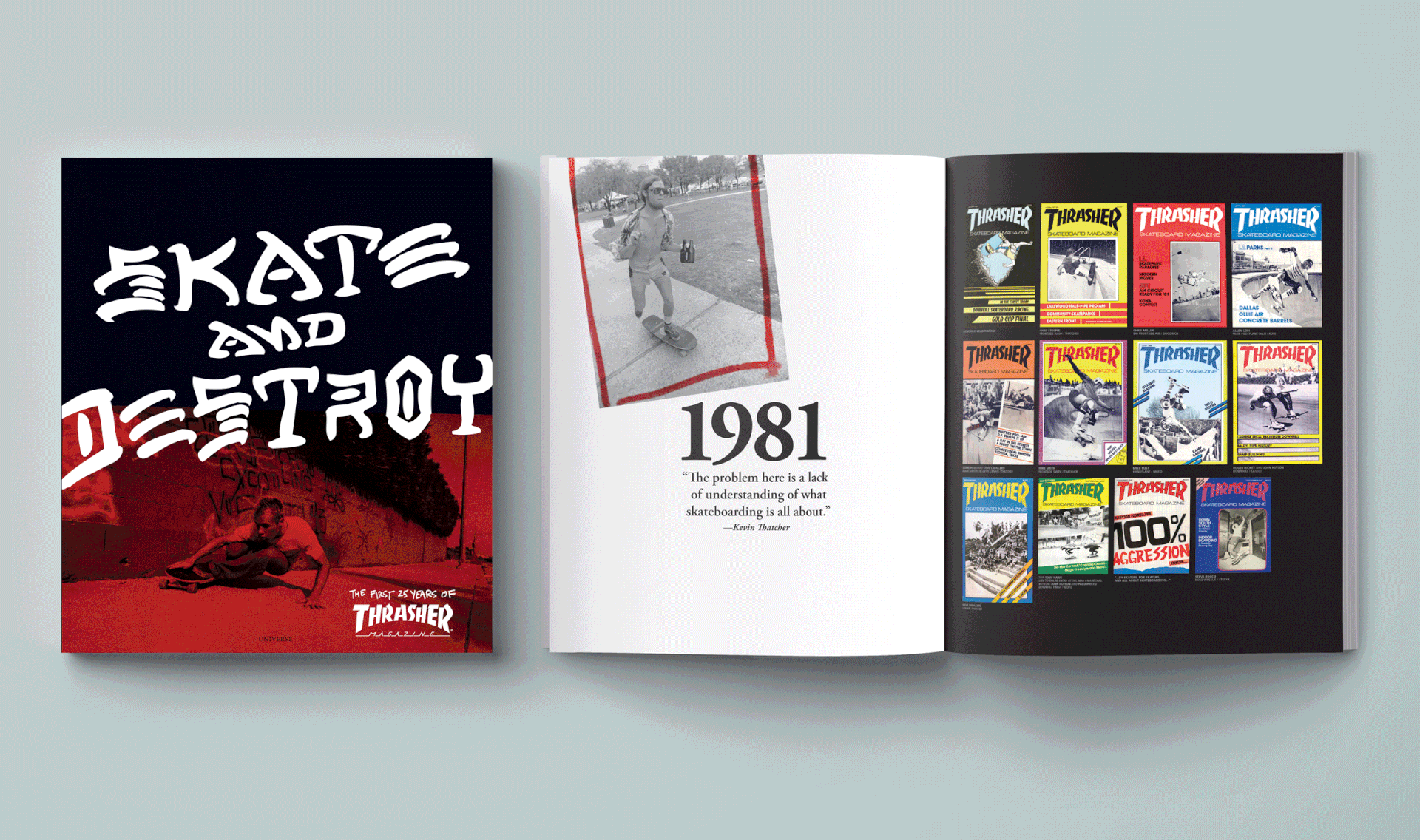
Skate and Destroy: The First 25 Years …
For their silver anniversary coffee table book, Dan was given the task of scanning old magazine layouts and compiling archival photos alongside editor in chief, Jake Phelps. The challenge then was to find a way to digest 300 issues worth of material into 288 pages, with additional content of never before seen photos, outtakes, and stories from the pros. They came up with a running timeline/collage of old layouts that ran throughout the bottom fifth of the spreads and stylized sidebars to highlight the interviews.
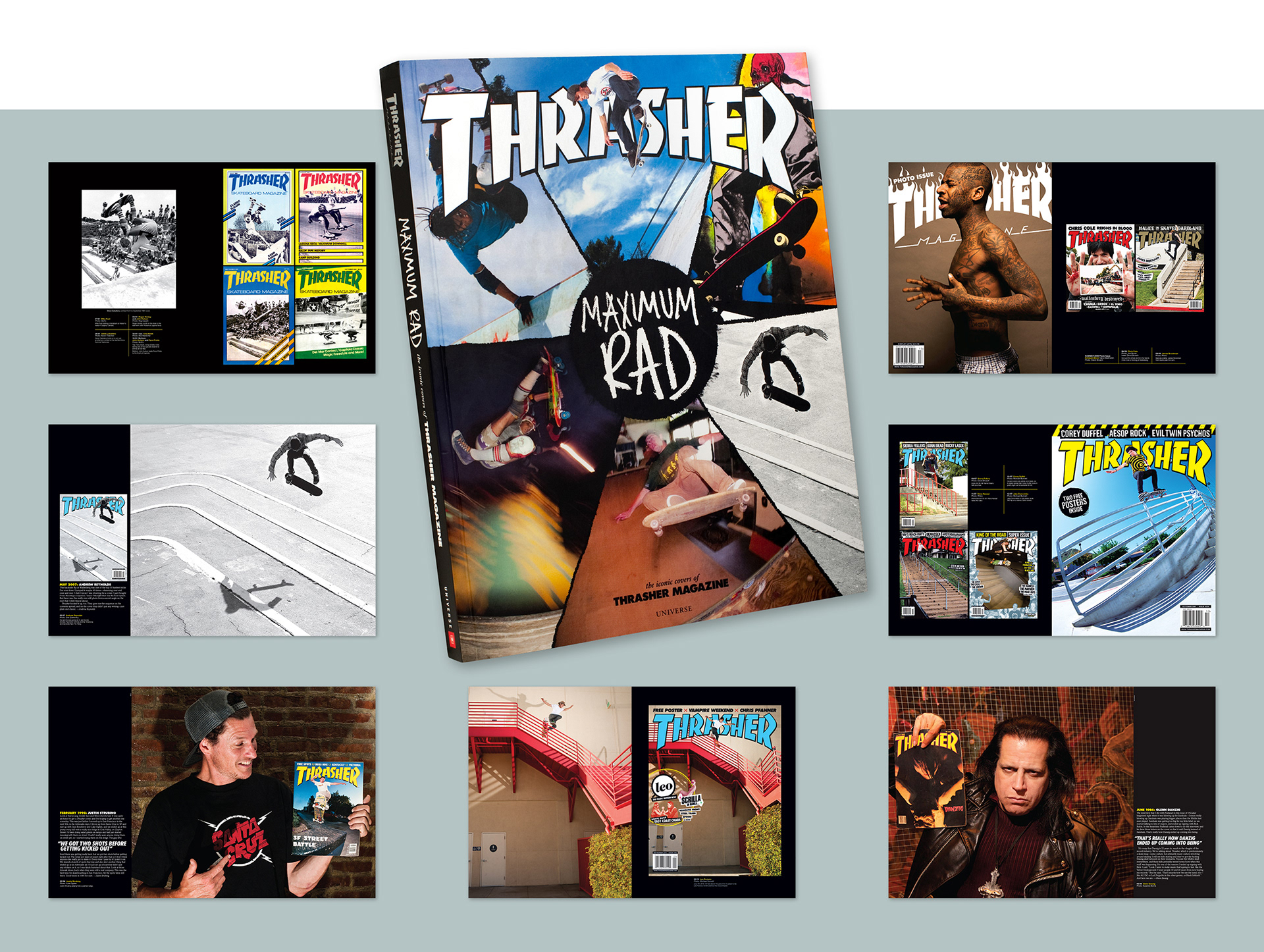
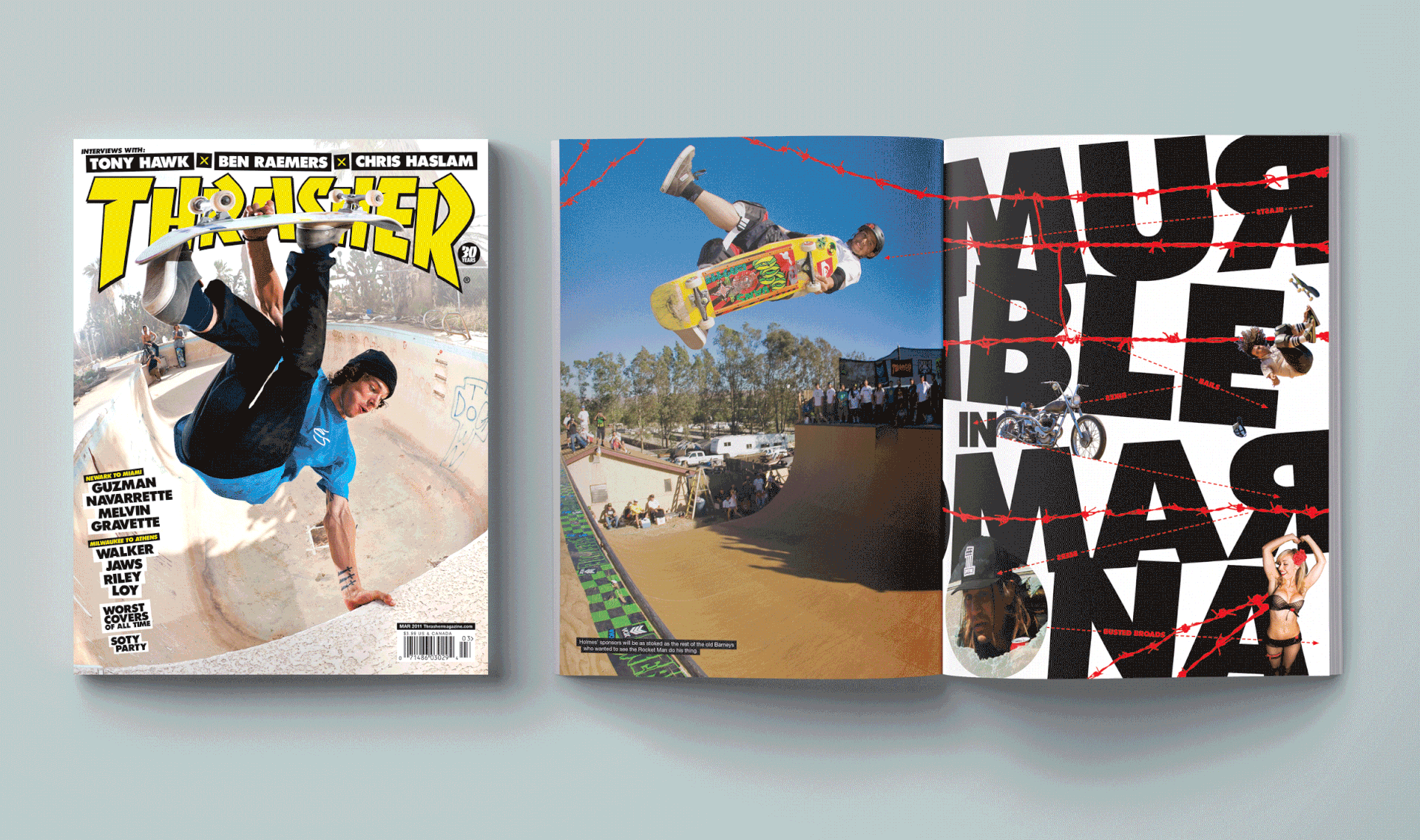
Maximum Rad: The Iconic Covers of Thrasher Magazine
Much more simple in terms of content, the goal was to find the best way to present all 12 covers from a year including special editions whenever applicable, showcase raw or alternate photos, and tell short stories from behind the scenes.
Back to First Section: NEW YORK MAG/THE CUT